
Source.io
Source.io is a global platform focused on organizing and accessing knowledge. The goal of this project was to create a modern, trustworthy, and scalable visual identity that reflects the company’s mission of simplifying access to information in a clean and intelligent way.
Design Approach:
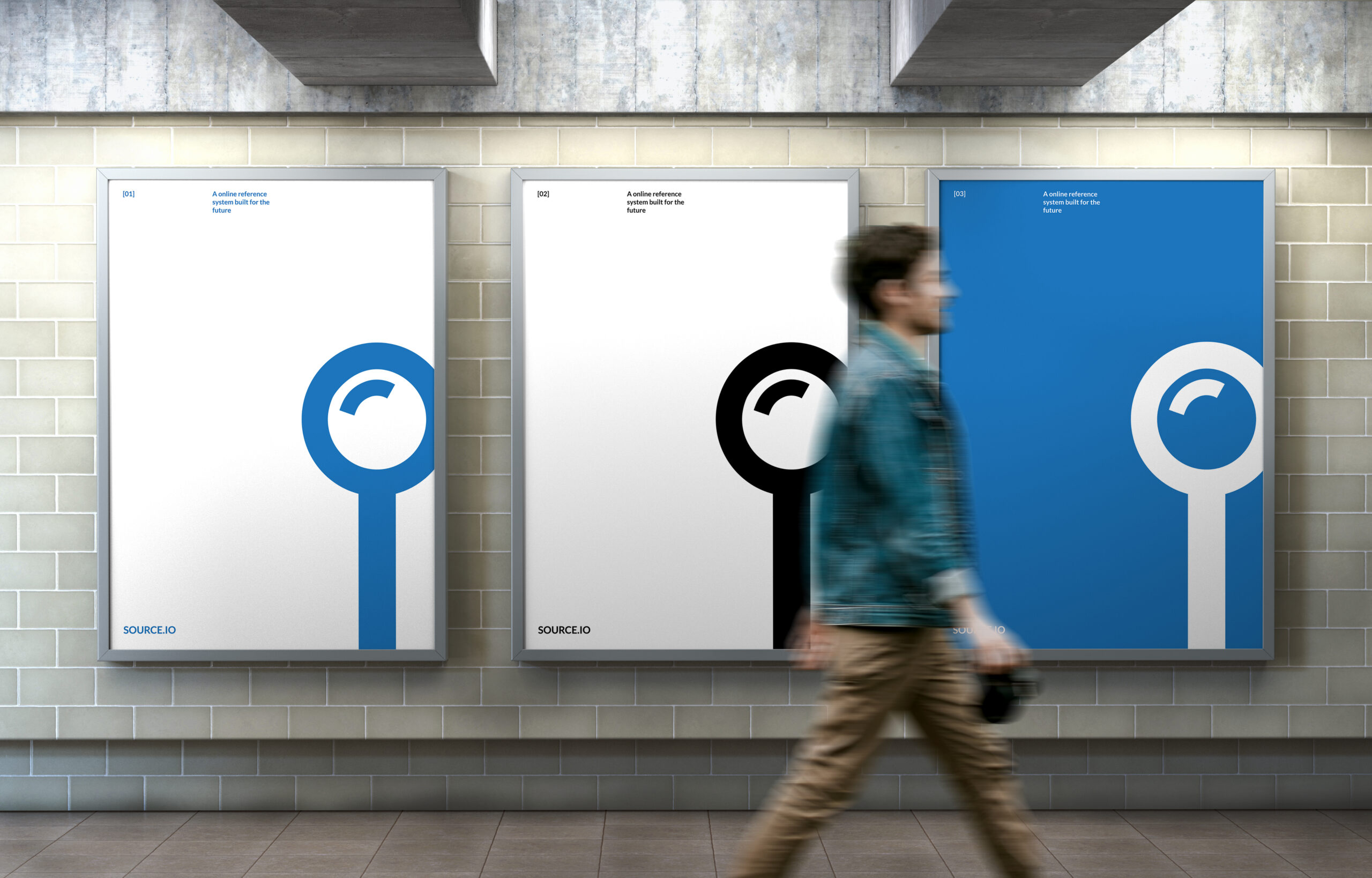
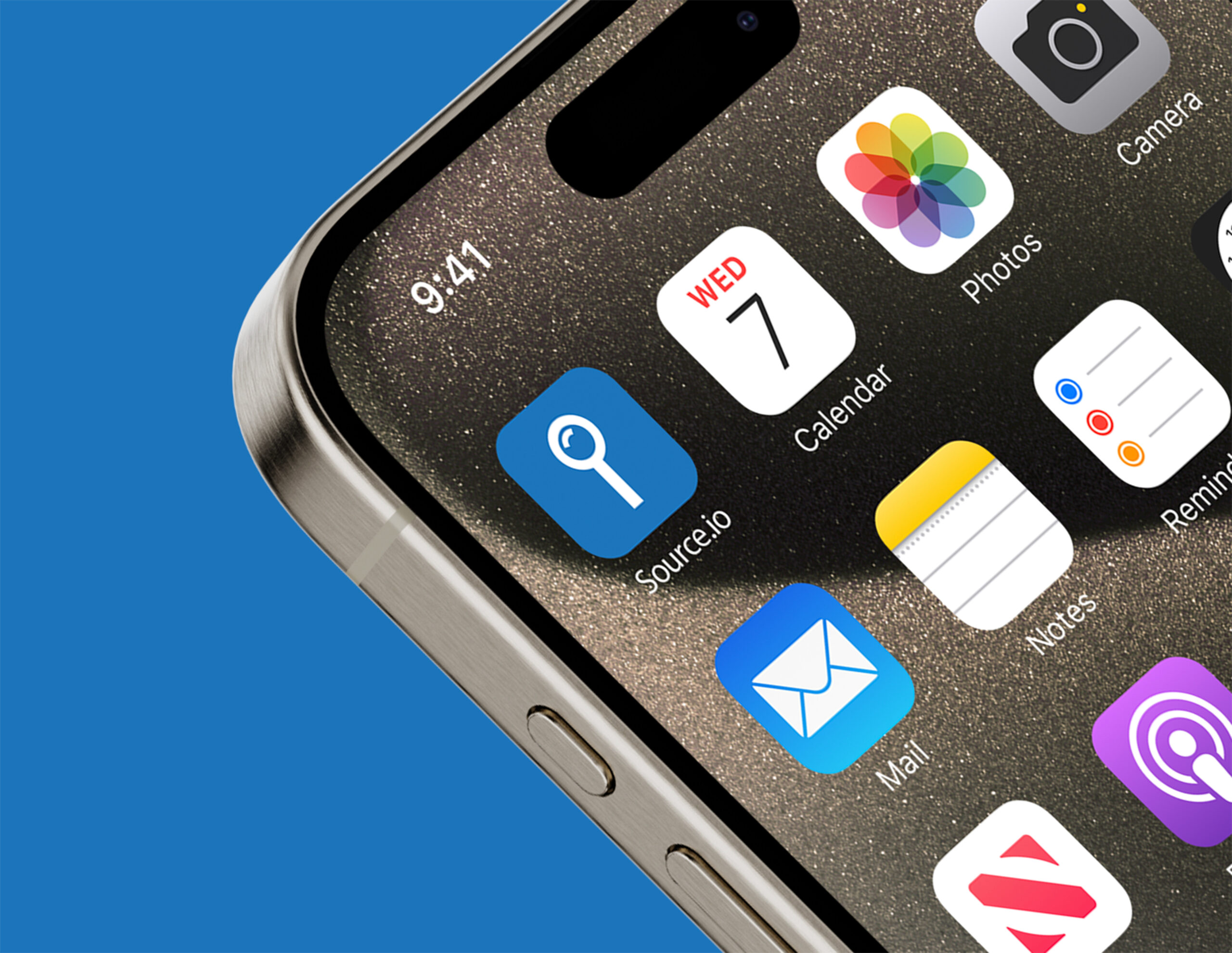
The identity is rooted in minimalism and clarity—hallmarks of good digital design. A geometric sans-serif logotype is paired with a simple, circular symbol resembling a magnifying glass or node, symbolizing “search,” “source,” and “connection.” This mark became a flexible graphic element across all brand touchpoints.
Visual Elements:
Logo: A clean wordmark with visual emphasis on the “.io” extension in blue, connecting it to the tech world.
Color Palette: Neutral base colors with a vibrant blue accent. The blue serves as an anchor for digital confidence and innovation.
Typography: A modern sans-serif typeface provides a professional and readable tone, suitable for both print and web.
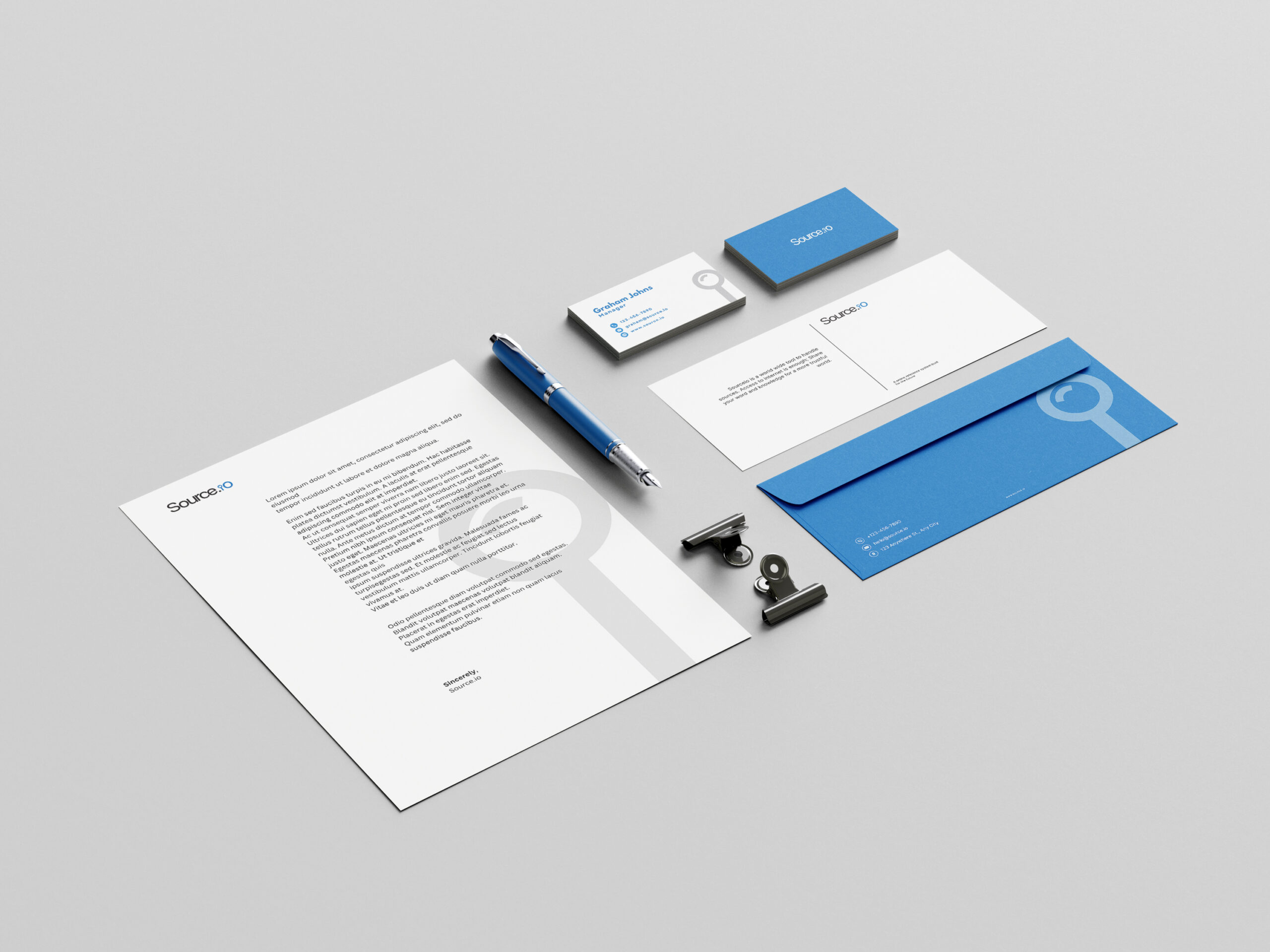
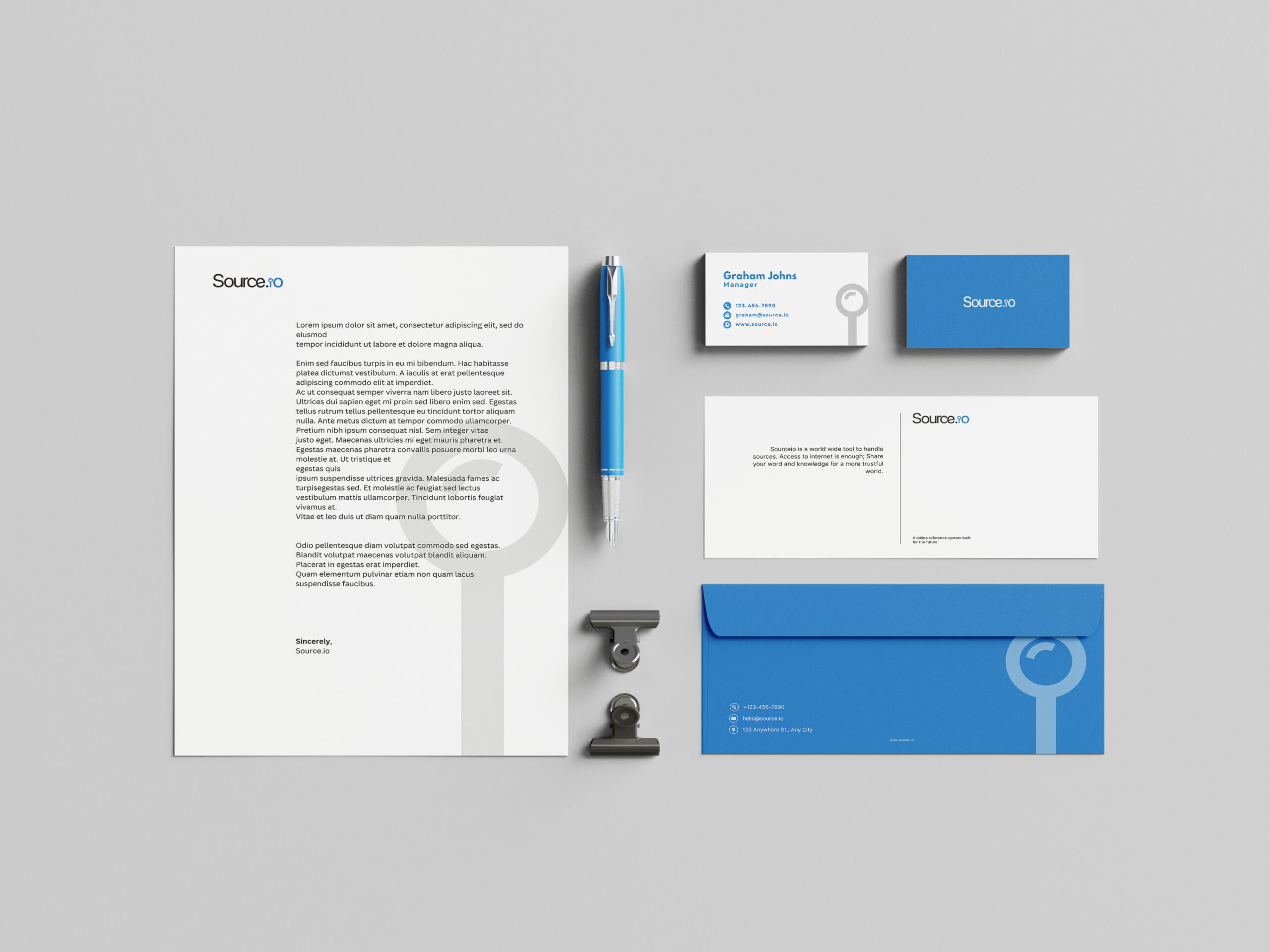
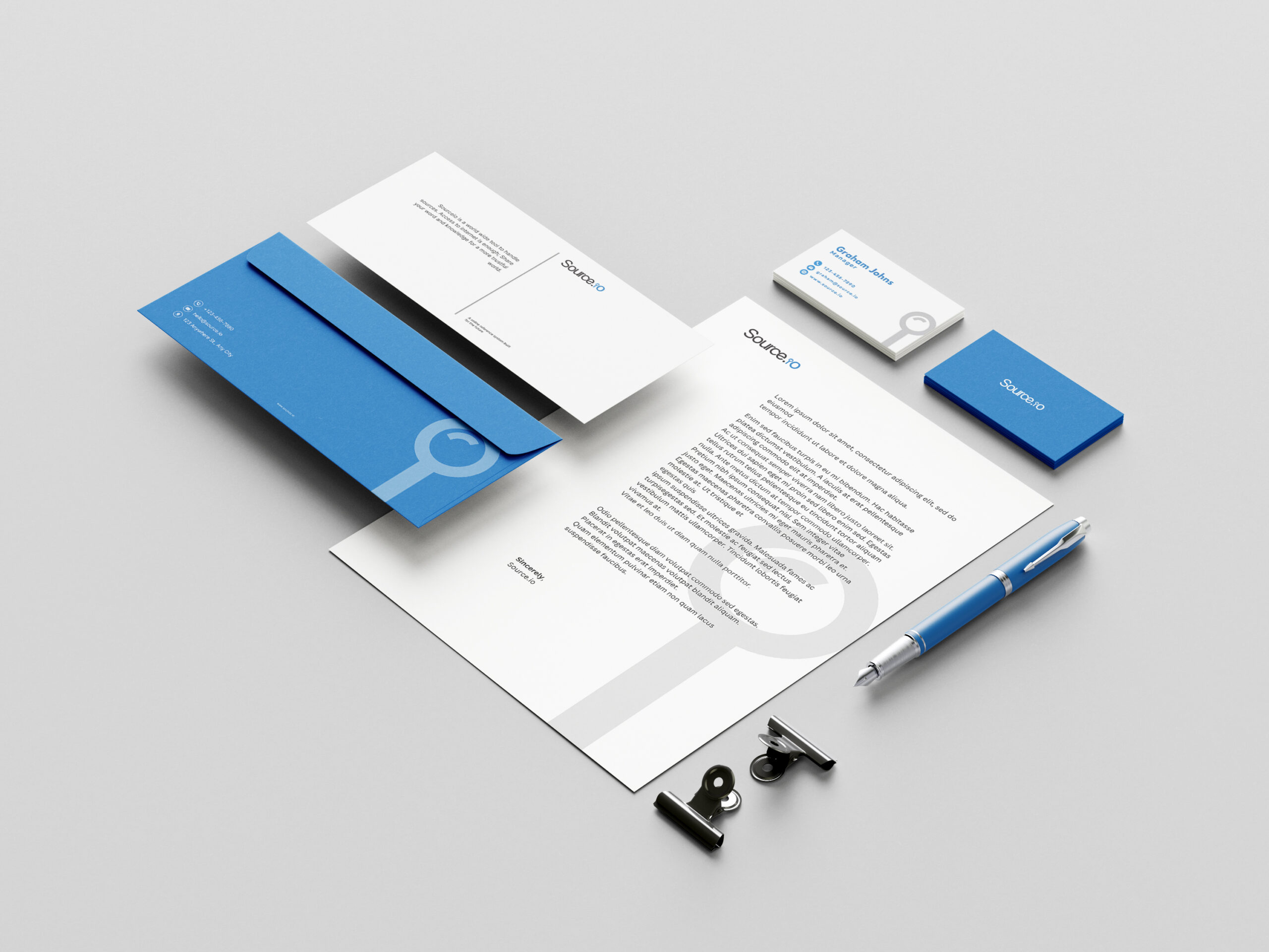
Stationery Design: Letterhead, business cards, and envelope designs reflect the brand’s minimal, structured identity while maintaining a strong corporate presence.
Outcome:
The result is a cohesive and professional identity system that communicates Source.io’s role as a clear and reliable digital resource provider. The branding is flexible, visually strong, and easy to implement across platforms—both digital and physical
Click any image to view full size.