
Back to portfolio




Visual Identity
HyperBizFlow
Problem: HyperBizFlow needed a cohesive and distinctive visual identity that would reflect its modern, dynamic character and communicate ideas of flow, growth, and innovation in business.
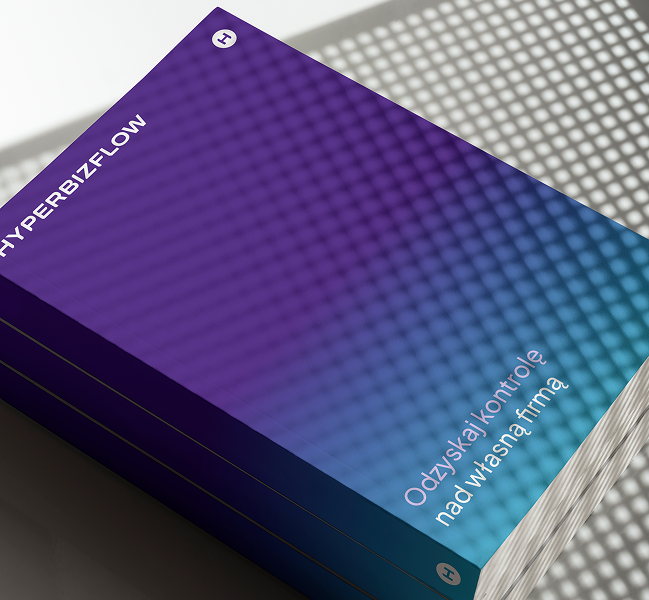
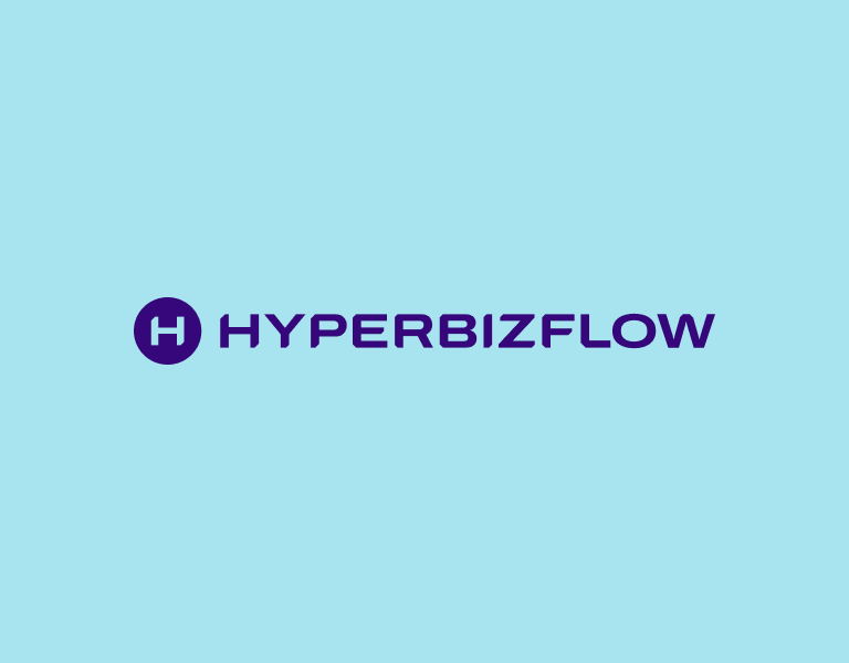
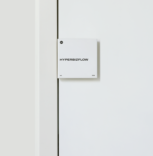
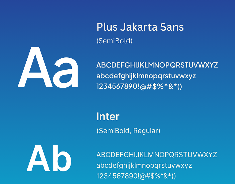
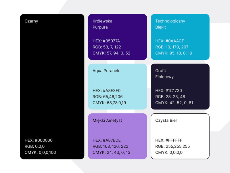
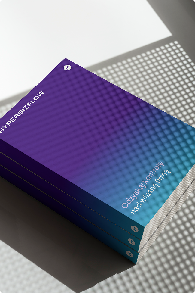
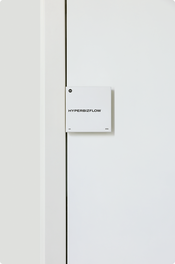
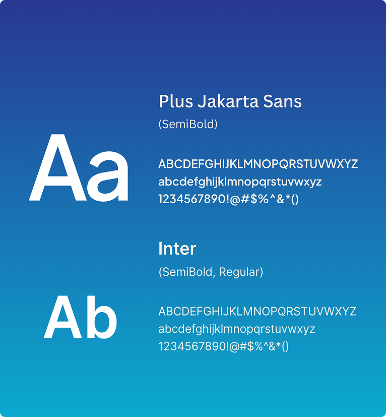
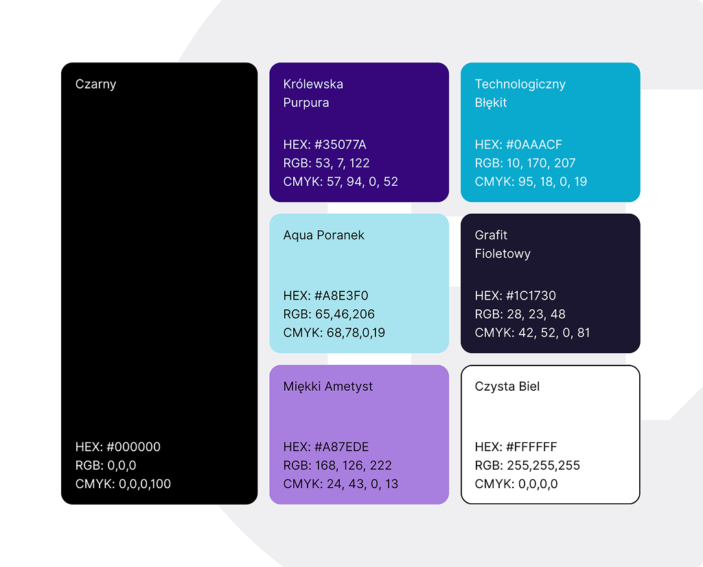
Solution: I created a minimalist, geometric “H” symbol based on the precise construction visible in the first image. A gradient transitioning from vibrant purple to turquoise emphasizes the brand’s modernity, energy, and sense of movement. Consistent typography, contrasting colors, and a grid-inspired visual language create a recognizable identity system. The second image showcases its application in an elegant, multi-element brand presentation that combines professionalism with a bold, technological character.





Click any image to view full size.